Logo, as the name defines the appearance of the company. Famous brands recognize millions of people. If you see a yellow letter «M», consisting of two arcs, then immediately remember McDonalds, and the contour nadgryzannogo apple remind you of Apple.
Any big company from time to time makes rebranding – gives its logo in line with the times, the philosophy of the brand, as well as their own goals. On the main visual image can trace the history of the brand itself, as well as the global marketing and design. And sometimes it is striving forward is associated with important events in the life of the company.
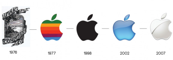
So, first on the logo of Apple Computers was painted apple with Isaac Newton and the inscription beneath Apple Computer Co on the tape. It is known that the Apple I computer sold slowly, so Steve Jobs decided that something needs to change, and started with the logo. Striped Apple came up with designer Rob Janoff of the Regis McKenna Agency. Bright option existed for 23 years until 1998, until re-become familiar monochrome after Jobs returned to the company.
YouTube user Nick Dileylo made a selection of videos dedicated to the evolution of the most famous logos of the company. One of the clips shows how the Apple logo from 1976 to the present.
Read another very interesting article about alternative energy of the Sun, water and air.


