
Redesign iOS 7 is not so flat, and it’s great. Matt shine, “letterpress” – are all present in one way or another. Now is the time to distance themselves from such concepts as “texture”, “skevomorfizm” other unpronounceable and difficult terms. And I think you have to try to dig a little deeper: to understand the culture and aesthetics that Apple puts in a phrase «Designed in California»: to hear the sounds of the surf and feel the spray of water on the skin of the beaches of Orange County, imbued serfboards subculture, try to soak up the same vibes as reckless guys with boards, dancing on the waves …
Why on such terms as “skevomorfizm” and “flat design” brings cheekbones? It’s simple – many operate on them, scattered right and left, without understanding the essence. It distracts from the main – from understanding the purpose of the whole business on the “restructuring” interface – a return to the basics and fundamentals.
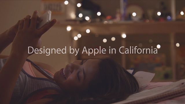
Designed by Apple
So, recently, «Designed in California» – the leitmotif of Apple, the inscription emblazoned on every device on every box has come off the assembly line. And this inscription – not just information or a nice slogan, but a new ideology of showing what the designers and engineers in Cupertino are investing in their products. In the words of the “Designed in California” invested a far greater significance than it might seem at first glance.

Leaves no doubt about the fact that by the name of «Mavericks» (a world famous iconic surf spot in California) for the latest version of OS X, but still lost the infomercial at the end of last presentation, Apple clearly and transparently hinted at who they are now. The company, through a unique impregnated technoculture Silicon Valley trends of the Los Angeles art mainstream, which absorbed the mood of one of the most gracious and carefree places on the planet, the sanctuary of billionaires and beggars hippie – Orange County.
The new iOS has turned strange. More alienated from the mainstream culture. And why is not that popular. In general, all are tired of the classic Apple, but there are more matte, more plastic, more air “Helvetica”, more light and soft gradients. More of California … Why? Because the company that inspired tens of thousands of designers, several generations of musicians, photographers and filmmakers went back to his home. «Back to basics».
Farewell, skevomorfizm, hello, surf-pop! West Coast is the Best Coast!

In 2011, Apple switched from the “exclusive”, oriented towards users of the company, “inclusive” – completely dedicated to the fans, but artificially limited in communication with someone else. This condition is similar to the time when the whole world was amazed by the famous commercials, it was in 1984, is a condition similar to the hippie culture. To understand this condition, you need to be “on the wave” of the mood, listen to musicians Generationals, Hot Chip, Fitz and the Tantrums, Edward Sharpe & The Magnetic Zeroes, visit the LA underground art performances and exhibitions, read Pitchfork, have a board for Finally surf. To imbued with something like this, watch the movie Surfer («Surfer, Dude») c Matthew McConaughey in the title role. Feel like a beach fight, for which there is no work, time, something frankly frivolous and that money can buy. He will always be surrounded sunshine, smiles and … the beach. Perhaps then you will understand the essence of a little “return» Apple.
Forms of genius Philippe Starck, whose influence is evident in the changed interface of iOS 7, and more details, minimalism and simplicity – it is more and more like a special, extended look at the composition of Beach Boys, lightly seasoned with sea shades and orange glow of sunset. Intentional geometric, straight lines, gradients, where they should be – they are used as a graphic designer and find a solution, but not as a logical interface element or imitation lighting. All this is the result of compulsion to Sir Johnny Ive to detail. This is by design. You may not like it. But if you like it – you’ll love it forever. And do not forget something else – “Surfing at Mavericks – the best!”
As an epilogue bring word Vila Giesler ( Wil Gieseler ) – director, designer and developer that “Death skevomorfizma greatly exaggerated.” By the way, he lives and works in the same iconic Orange County.
Read another very interesting article about alternative energy of the Sun, water and air.